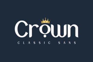
Crown
Crown isn’t just another sans serif—it’s a deliberate response to how we communicate today. In an era where attention is fragmented, interfaces are increasingly adaptive, and brand authenticity is judged in milliseconds, typography carries more weight than ever. Crown stands out not by shouting, but by speaking with clarity, consistency, and quiet confidence. Its clean geometry, balanced proportions, and generous x-height make it highly legible across screens, print, and physical spaces—without sacrificing personality.
Why Crown Fits the Way We Work—and Live—Now
Modern workflows demand flexibility. Designers juggle Figma files, CMS editors, packaging mockups, social media assets, and responsive websites—all within the same project. A typeface like Crown bridges those contexts seamlessly. Its robust character set supports multilingual branding, its optical sizing variants adapt gracefully from mobile headlines to large-format posters, and its restrained contrast avoids visual fatigue during long editorial reads.
This adaptability reflects broader shifts: remote collaboration tools have normalized real-time design reviews; small businesses launch full digital presences before opening brick-and-mortar locations; educators create visually rich learning materials without formal design training. Crown meets these users where they are—not as a “designer-only” tool, but as a practical asset for anyone shaping perception through text.
From Brand Identity to Everyday Clarity
Consider a local coffee roaster launching their first website and product line. They need a logo that works on a tiny app icon and a 48-inch storefront banner. They need packaging labels readable at arm’s length and ingredient lists legible under café lighting. They need social posts that feel cohesive whether viewed on iOS or Android. Crown delivers that continuity—not because it’s “versatile” in theory, but because its letterforms were built with consistent rhythm, open counters, and unambiguous shapes.
That same logic applies to educators designing slide decks, freelancers pitching proposals, or nonprofits updating annual reports. When readers encounter Crown in a headline, then again in body copy or a call-to-action button, the experience feels intentional—not accidental. That perceived intentionality builds trust, even when the reader can’t name why.
Readability Isn’t Just About Size—It’s About Context
Great readability means more than big letters or wide spacing. It means recognizing how people actually consume content: scanning on phones while commuting, skimming email newsletters between meetings, reading packaging while holding a grocery bag, or focusing deeply on long-form journalism in a quiet room. Crown’s design anticipates those varied conditions.
Its generous apertures (like in a, e, and s) prevent characters from closing up at small sizes. Its uniform stroke width reduces rendering inconsistencies on low-DPI screens. Its lowercase g and q avoid overly stylized tails that distract or confuse. These aren’t aesthetic flourishes—they’re functional decisions grounded in how eyes move, how devices render pixels, and how attention behaves in real life.
Evolving Expectations, Not Just Evolving Fonts
Type design hasn’t changed dramatically in the last decade—but how we use type has. Ten years ago, many brands treated typography as a static layer: one font for logos, another for web, a third for print. Today, systems thinking dominates. Designers build typographic scales—not isolated fonts, but coordinated families with purpose-built weights, widths, and optical sizes. Crown was conceived within that mindset. It includes distinct display and text cuts, each optimized—not merely scaled—for its intended role.
This evolution mirrors larger trends: the rise of design systems in tech companies, the emphasis on accessibility compliance (Crown’s contrast ratios meet WCAG AA standards at standard sizes), and the growing expectation that digital experiences feel coherent across devices. It’s no longer enough for a font to look good in a specimen sheet. It must perform reliably in production environments—from Shopify themes to React components to PDF exports.
Real-World Use Cases—Beyond the Obvious
- Editorial platforms: Newsletters and blogs benefit from Crown’s balanced rhythm in both headlines and body text. Unlike ultra-thin display fonts that vanish on older screens, Crown’s medium weight remains crisp even on budget laptops.
- Product packaging: Its sturdy lowercase forms hold up well in flexographic printing, where fine details often blur. The uppercase “C” and “R” maintain distinction at 8pt on a tea box label.
- Internal dashboards: Teams using Crown for data visualization headers report improved scan speed during daily standups—especially in hybrid meeting settings where participants join via laptop, tablet, or conference room displays.
- Educational materials: Teachers using Crown in slide decks note fewer student questions about “what does this say?” during live instruction—freeing mental bandwidth for concept discussion instead of decoding.
What This Means for You—Not Just Your Designer
You don’t need a design degree to benefit from thoughtful typography. If you manage a small business website, choose Crown for your headline hierarchy—it communicates professionalism without pretension. If you write blog posts or newsletters, pair it with a neutral serif for body text to create subtle visual hierarchy that guides readers naturally. If you’re building a presentation for investors, use Crown’s bold weight for section titles and its regular weight for supporting points—no extra plugins or custom CSS required.
Importantly, Crown doesn’t require perfectionism to work. Its strength lies in its reliability, not its rarity. You won’t need to kern every headline manually, adjust tracking for every screen size, or commission custom ligatures. That simplicity saves time—time that creators, entrepreneurs, and educators consistently cite as their most constrained resource.
Choosing Type in a World of Noise
We’re surrounded by visual noise: autoplay videos, flashing banners, algorithm-driven feeds, and infinite scroll. In that environment, restraint becomes a strategic advantage. Crown doesn’t compete for attention—it earns it through consistency and calm authority. That’s why it resonates with brands moving away from “loud” aesthetics toward clarity-focused identities: sustainable fashion labels, mental wellness apps, independent publishers, and community-led initiatives.
It’s also why Crown appears more frequently in B2B contexts—not because it’s sterile, but because decision-makers respond to signals of competence and coherence. A SaaS landing page using Crown feels stable and considered. A nonprofit’s annual report in Crown conveys respect for the reader’s time and intelligence. None of this is accidental. It’s the result of deliberate design choices aligned with how people process information today.
A Practical Starting Point
If you’re exploring Crown for your next project, begin small. Replace just your main headline font—not your entire system. Test it at three sizes: 24px (desktop H2), 16px (mobile body), and 36px (hero banner). Notice how the letterforms hold shape, how spacing feels natural without adjustment, and how it pairs with your existing color palette. You’ll likely find it requires less tweaking than expected.
For teams adopting Crown across departments, start with shared Figma libraries or Google Fonts links—no licensing complexity, no self-hosting overhead. Its availability in variable font format means you can adjust weight and width dynamically, reducing file bloat and increasing design agility.
Typography won’t solve every communication challenge. But choosing a typeface like Crown—grounded in readability, built for modern constraints, and designed for real-world use—removes friction before it begins. That’s not just good design. It’s respectful design. And in a world increasingly defined by speed and scale, respect for the reader’s attention may be the most valuable differentiator of all.